Color choices are at the heart of every weaving project, shaping more than just the surface of your creation. They have the power to influence mood, define a style, and amplify the visual impact of a piece. Whether you’re aiming for a bold statement or a subtle harmony, the colors you choose will determine the final product and color theory can aid your decision making.
Selecting colours for weaving does not come naturally to everyone, in fact it is something that I am consulted about frequently.
In this article, we’ll explore why color matters in weaving, how you can use it to elevate your designs and look at tools that are available to help.
The Basics of Color Theory
- The Color Wheel:
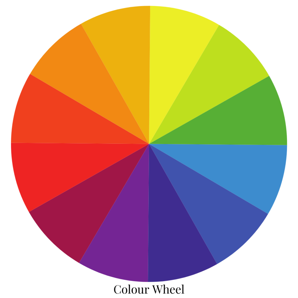
The color wheel is a great tool for any weaver looking to make intentional and impactful color choices. It visually organizes colors in a way that highlights their relationships, making it easier to create harmonious or contrasting combinations. This is so beneficial as a starting point for someone who feels hesitant about choosing colors.
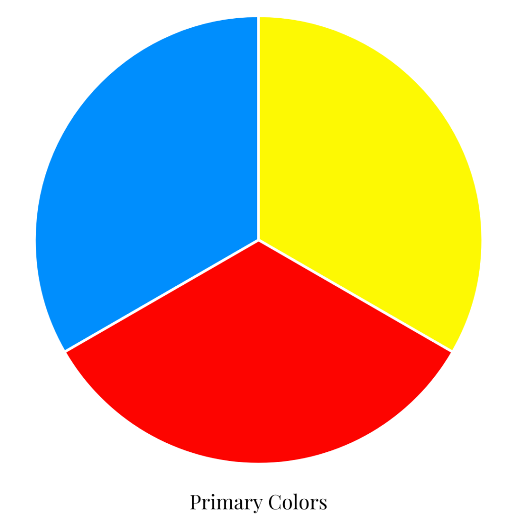
Primary Colors
At the heart of the color wheel are the primary colors: red, blue, and yellow. These are the building blocks of all other colors, as they cannot be created by mixing other hues. When used in weaving, primary colors can create bold, eye-catching designs or serve as anchors for more complex color palettes.
Secondary Colors
Secondary colors—orange, green, and purple—are created by mixing equal parts of two primary colors. For example, mixing red and yellow creates orange, while blue and yellow make green. These colors often serve as bridges, adding balance and versatility to your weaving projects.
Tertiary Colors
Tertiary colors result from blending a primary color with a neighboring secondary color on the wheel. Examples include red-orange, yellow-green, and blue-violet. These nuanced hues are perfect for adding depth and sophistication to your woven designs, allowing you to move beyond basic color combinations.

- Color Relationships:
By understanding complementary, analogous, and triadic color schemes, you can design pieces that evoke specific moods and achieve a polished look.
Complementary Color Schemes
Complementary colors sit opposite each other on the color wheel, such as blue and orange, red and green, or yellow and purple. These pairings create a high-contrast, dynamic effect that makes each color stand out. In weaving, complementary colors are ideal for bold, attention-grabbing designs.

Analogous Color Schemes
Analogous colors are neighbors on the color wheel, like blue, blue-green, and green or red, red-orange, and orange. These schemes create a harmonious, soothing effect because the colors share a similar base. Analogous palettes are perfect for weaving projects with a natural or calming vibe.
Triadic Color Schemes
Triadic color schemes use three colors evenly spaced around the color wheel, such as red, yellow, and blue or purple, green, and orange. These combinations are vibrant and balanced, offering plenty of contrast while maintaining harmony. Triadic schemes work well in playful or artistic weaving projects where bold and cheerful designs are the goal.
- Warm vs. Cool Colors:
he choice between warm and cool colors can dramatically influence the mood and atmosphere of your woven pieces.
Warm Colors: Energizing and Inviting
Warm colors include hues like red, orange, and yellow. These colors are often associated with energy, warmth, and enthusiasm.
Warm colors tend to “advance,” meaning they appear closer to the viewer, which can make a woven piece feel more dynamic and engaging. If you’re creating a focal point in your weaving, incorporating warm colors can draw attention and create a vibrant centerpiece.
Cool Colors: Calming and Serene
Cool colors include shades like blue, green, and purple. These hues can evoke feelings of calm, tranquility, and relaxation.
Cool colors tend to “recede,” giving an impression of depth and spaciousness. This quality makes them great for weaving projects where you want to emphasize subtlety and create a serene visual flow.
Blending Warm and Cool Colors for Balance
Using both warm and cool colors in a single project can create stunning contrasts and balanced designs. For example, combining warm oranges with cool blues can result in a visually striking piece that feels both energetic and grounded.
By thoughtfully choosing warm or cool colors—or a combination of both—you can tailor the mood and style of your weaving projects to suit any setting or purpose.
Check out this cool interactive color wheel changer that allows you to see all different combinations just by clicking.

Choosing Colors for Weaving Projects
- Understanding Yarn Interactions
The weave structure, yarn type (glossy, matt, thick, thin), scale of the pattern and the distance at which the item is viewed can all affect color perception. Some combinations of these factors can produce the serendipity of iridescence, which is a beautiful “glow” to your work. - Sample Before You Commit:
The very best way to ensure you will be happy with your weaving project is to sample first, using your selected colours. Sampling tells you a lot of what you need to know for a successful project! - Do What You Love:
Ultimately, choose colors that you love and that make you happy. This may involve choosing colors that may not be typically considered to “go together”. That’s ok, it’s your project, you’re paying for the yarn and putting in the effort and presumably you’re a grown up – so do what you want! 😀

Color Inspiration is all around you!
- Find Ideas in the World Around You:
Take photos when you’re out and about of sunsets, forests, flowers, buildings, outfits people are wearing – there is just so much inspiration right before your eyes! - Use Tools Online:
There are many free tools available online to help you pick out colors. This one allows you to use a photograph to arrange a color palette. If you’re looking to make harmonious stripes this free stripes generator is fun. If you have no idea which colors to pick for your next project, try this random color generator. You can tell it how many colors to select, choose them from the color wheel or from a huge pool of colors and other simple specifications. There are also many color apps to choose from, many of them are free.

Would you like the Color Theory Basics in a printable format to refer back to? I’ve put together a free printable Color Theory Basics Guide here:
For members of the Online Weaving School I have a Gaining Confidence with Color Workshop available.

Incorporating color theory into your weaving projects can transform your creations from beautiful to breathtaking. By understanding how colors interact and choosing palettes that reflect your vision, you can create pieces that evoke emotion, tell stories, or simply bring joy. Whether you lean on classic harmonies, experiment with bold contrasts, or take inspiration from the natural world, the key is to let your creativity guide you. As you explore and refine your approach to color in weaving, remember that every choice adds to your unique artistic voice. So, gather your yarns, trust your instincts, and let color bring your weaving to life!
Until next time…
Happy Weaving!
